

Last Error
The Last Error widget shows the most recent error image in a single card, together with an interactive dialog that presents the detailed analysis results and their metadata. It updates automatically every time a new error image is received, allowing real-time monitoring of system anomalies.
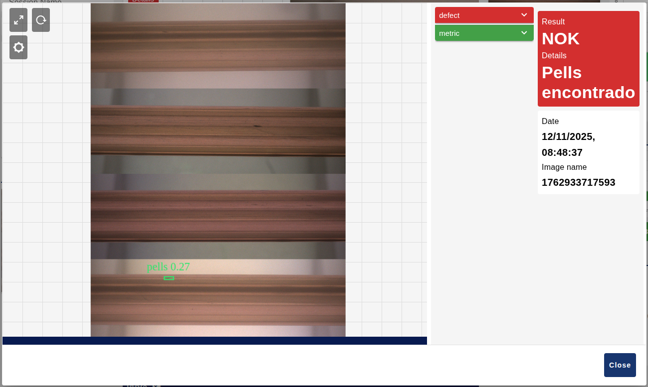
Clicking the card opens a dialog with the high-resolution image rendered on a Fabric.js canvas, with zoom, pan, dynamic image type selection, bounding box and polygon overlays, and panels with the model results and performance metrics.
Features
- Single error display: shows the most recent error image in a single card format.
- Interactive error dialog: high-resolution image rendered on a Fabric.js canvas.
- Advanced zoom and pan: mouse wheel zoom, pinch-to-zoom and drag to pan.
- Dynamic image type selection: configurable image types for multi-type display.
- Bounding box overlay: visual highlighting of detected objects or regions.
- Polygon overlay: semi-transparent filled polygons for segmentation masks.
- Full error analysis: model results, rule evaluation and performance metrics.
- State management: persistence of the viewport transform (zoom and position) and the brightness filter.
- Colour-coded indicators: red for NOK and green for OK.
Configuration
| Property | Description | Default |
|---|---|---|
group | Dashboard group where the widget is displayed. Required. | — |
localeConfig | Locale configuration node (rosepetal-locale-config) that timezone, dateFormat and timeFormat are taken from. Optional. | "" |
name | Node name shown in the editor. | '' |
order | Order of appearance within the group. | 0 |
width | Widget width (0 = fit automatically to the group). | 0 |
height | Widget height (0 = fit automatically). | 0 |
showMaskImage | Enables/disables the mask image toggle in the dialog. | false |
showMaskCheckbox | Shows a checkbox in the dialog to toggle mask visibility. | true |
showBboxCheckbox | Shows a checkbox to toggle bounding box visibility. | true |
showAnnotationCheckbox | Shows a checkbox to toggle the bounding box labels. | true |
showPolygonCheckbox | Shows a checkbox to toggle polygon visibility. | true |
closeButtonText | Custom text of the dialog close button. | 'Close' |
numberOfImages | Number of image type entries to display (0-9). | 0 |
imageTypes | Names of the image types used for dynamic loading. They must match the keys of payload.imageShow. | [] |
Input
This node has 1 input.
The message is only stored when msg.payload contains one of these properties: imageShow, imageData, videoShow, videoData or polygons.
Error image data
The main format uses the multi-type imageShow structure, whose keys must match the configured Type names:
| Property | Description |
|---|---|
imageShow | Multi-type image structure. Each key is an image type with a configurable name (raw in the example). |
result | Detection result. |
tag | Detected tag or classification. |
isAnomalous | Indicates whether the image is anomalous. |
date | Date object or ISO timestamp. |
name | Image name or identifier. |
performance | Performance metrics. |
ocr | Barcode OCR result. |
resume | Model evaluation results. |
Within each imageShow type, imageDataThumbnailMask, imageDataMask and bbox (bounding boxes) are optional.
msg.payload = {
    imageShow: {
        "raw": {
            imageData: "data:image/jpeg;base64,/9j/4AAQSkZJRg...",
            imageDataThumbnail: "data:image/jpeg;base64,/9j/4AAQSkZJRg...",
            imageDataThumbnailMask: "data:image/jpeg;base64,...",
            imageDataMask: "data:image/jpeg;base64,...",
            bbox: [
                {
                    x_rel: 0.1,
                    y_rel: 0.2,
                    w_rel: 0.3,
                    h_rel: 0.4,
                    color: "red",
                    tag: "defect",
                    score: 0.95
                }
            ]
        }
    },
    result: "NOK",
    tag: "defect",
    isAnomalous: true,
    date: "2024-01-15T10:30:00Z",
    name: "error_001.jpg",
    performance: {
        milliseconds: 1250,
        jimp_read: { milliseconds: 150 },
        convert: { milliseconds: 200 },
        classify: { milliseconds: 900 }
    },
    ocr: "BARCODE123",
    resume: {
        "model1": {
            isAnomalous: true,
            score: 0.95,
            minScore: 0.8,
            result: "Defect detected",
            ruleResults: [
                {
                    tag: "contrast",
                    param: "min",
                    resultValue: 0.5,
                    operation: "<",
                    value: 0.7,
                    result: true
                }
            ]
        }
    }
};Legacy format (single image)
If imageShow is not present, the widget automatically falls back to the legacy single-image format:
msg.payload = {
    imageData: "data:image/jpeg;base64,/9j/4AAQSkZJRg...",
    imageDataThumbnail: "data:image/jpeg;base64,/9j/4AAQSkZJRg...",
    result: "NOK",
    isAnomalous: true,
    date: "2024-01-15T10:30:00Z"
};Polygons (optional)
msg.polygons overlays segmentation masks on the image:
| Property | Description |
|---|---|
points | [x_rel, y_rel] pairs with relative coordinates in the 0-1 range. |
color | Fill and stroke colour, in rgb(r,g,b) format. |
tag | Class label (optional). |
confidence | Confidence between 0 and 1 (optional). |
alpha | Transparency between 0 and 1 (optional, 0.5 by default). |
msg.polygons = [
    {
        points: [[0.58, 0.59], [0.59, 0.60]],
        color: "rgb(116,37,162)",
        tag: "blister_nok",
        confidence: 0.95,
        alpha: 0.5
    }
];Configuration messages
configViewportLastError receives the transform array that restores the viewport, that is, the zoom and the position:
msg.payload = {
    configViewportLastError: [1, 0, 0, 1, 0, 0]
};configBrightness adjusts the brightness filter, in the range -1 to 1:
msg.payload = {
    configBrightness: 0.5
};Output
This node has 1 output.
It emits a message with the transform array when the canvas position and zoom are saved from the interactive dialog:
msg.payload = {
    saveViewportTransformLastError: [1, 0, 0, 1, 0, 0]
};Usage example
Send an error image with multi-type support:
msg.payload = {
    imageShow: {
        "raw": {
            imageData: "data:image/jpeg;base64,/9j/4AAQSkZJRg...",
            imageDataThumbnail: "data:image/jpeg;base64,...",
            bbox: [
                {
                    x_rel: 0.1,
                    y_rel: 0.2,
                    w_rel: 0.3,
                    h_rel: 0.4,
                    color: "red",
                    tag: "defect"
                }
            ]
        }
    },
    result: "NOK",
    isAnomalous: true,
    date: "2024-01-15T10:30:00Z",
    name: "error_001.jpg"
};
return msg;With the widget configured with an image type named raw, the card will show the thumbnail of the most recent error with a red (NOK) indicator. Clicking it opens the dialog with the full image, the bounding box of the defect and the analysis panels.