

Button Confirm
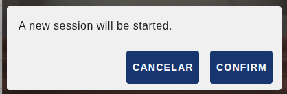
The Button Confirm widget shows a customisable button that can ask for confirmation before running an action. When pressed, if a confirmation text has been defined, a modal dialog opens where the user can cancel or confirm; if there is no confirmation text, the action runs immediately.
Besides the confirmation, the button keeps a two-position state (normal and pressed). Each confirmation toggles that state, which allows the displayed label and icon, as well as the dialog text, to change dynamically. The state can also be controlled from the flow through input messages, and the button can be enabled or disabled programmatically.

Features
- Customisable button: define the button label and icon (Material Design Icons).
- Dynamic state change: the label and icon can change when the button is pressed.
- Optional confirmation dialog: shows a dialog before running the action.
- State-aware confirmation: different confirmation messages for the normal and pressed states.
- Customisable dialog buttons: configurable texts for the Cancel and Confirm buttons.
- State management: the button state can be controlled through input messages.
- Enable/Disable: the button can be enabled or disabled programmatically.
- Toggle behaviour: sends
payload: truewhen activated andpayload: falsewhen deactivated.
Configuration
| Property | Description | Default |
|---|---|---|
| Name | Node name shown in the editor. | "" |
| Group | Dashboard group where the button is displayed. | — (required) |
| Size | Widget width and height (0 = fit automatically to the group). | 0 x 0 |
| Label | Text shown on the button in its normal state. | "" |
| Icon (mdi) | (Optional) Material Design icon shown before the text (for example mdi-play). | "" |
| On-Click Label | (Optional) Text shown on the button after pressing it (pressed state). | "" |
| On-Click Icon (mdi) | (Optional) Material Design icon shown in the pressed state (for example mdi-stop). | "" |
| Confirmation text | (Optional) Confirmation dialog text in the normal state. | "" |
| On-Click Confirmation text | (Optional) Confirmation dialog text in the pressed state. | "" |
| Cancel button text | Text of the dialog Cancel button. | CANCEL |
| Confirm button text | Text of the dialog Confirm button. | CONFIRM |
Input
This node has 1 input. The received msg lets you control the button state and whether it is enabled without any user interaction.
msg.payload.status (boolean): controls the button state. With true it switches to the pressed state and shows the On-Click label and icon; with false it returns to the normal state.
msg.payload = { status: true };msg.enabled (boolean): enables or disables the button. When it is false the button appears dimmed and can no longer be pressed.
msg.enabled = false;Both properties can be combined in the same message to set the state and the enabled flag at once:
msg.payload = { status: true };
msg.enabled = true;Output
This node has 1 output. It emits a message every time the user presses the button and confirms the action (or directly on press, if there is no confirmation text):
- From normal to pressed state: sends
payload: true. - From pressed to normal state: sends
payload: false.
The internal state toggles after each confirmation.
Usage example
A start/stop button for a process, with confirmation in both states. The node configuration would be:
| Property | Value |
|---|---|
| Label | Start process |
| Icon (mdi) | mdi-play |
| Confirmation text | Are you sure you want to start the process? |
| On-Click Label | Stop process |
| On-Click Icon (mdi) | mdi-stop |
| On-Click Confirmation text | Are you sure you want to stop the process? |
When confirming from the normal state the node emits msg.payload = true and the button switches to showing "Stop process". When confirming from the pressed state it emits msg.payload = false and goes back to showing "Start process".
To set the button to the active state from the flow:
msg.payload = { status: true };
return msg;To disable it:
msg.enabled = false;
return msg;